tabbar #
tabbar 提供了自定义 tabbar 的UI以及包含子组件与跳转的能力。
可以基于自定义的tabbar,实现不同的tabbar需求,以及动画能力。
使用 #
以下代码并不是完整的代码。具体使用请看 nPro 的demo。
<template>
	<view>
		<n-tabbar ref="tabbar" :tabs="tabs" :tabStyle="tabStyle" @tabClicked="tabbarSwitched">
			<home></home>
			<mine></mine>
		</n-tabbar>
		<plus :show="plusVisible" @cancel="toHidePlus"></plus>
	</view>
</template>
	import home from './home.vue'
	import mine from './mine.vue'
	import plus from './plus.vue'

	import navHelper from '@/service/navHelper.js'

	export default {
		components: {
			home,
			mine,
			plus
		},
		mixins: [navHelper],
		provide() {
			return {
				tabRoot: this
			}
		},
		data() {
			return {
				plusVisible: false,
				tabs: [
					{
						icon: '/static/tabs/home.png',
						selectedIcon: '/static/tabs/homeH.png',
						title: '首页',
						selectedTitle: '首页'
					},
					{
						icon: '/static/tabs/plus.png',
						selectedIcon: '/static/tabs/plus.png',
						title: '',
						selectedTitle: '',
						iconBoxWidth: '76px',
						iconStyle: 'width: 60px;height:38px;',
						selectedIconStyle: 'width: 60px;height:38px;',
						noPage: true
					},
					{
						icon: '/static/tabs/mine.png',
						selectedIcon: '/static/tabs/mineH.png',
						title: '我的',
						selectedTitle: '我的'
					}
				],
				tabStyle: {
					iconStyle: 'width:22px;height:22px;',
					selectedIconStyle: 'width:22px;height:22px;',
					titleStyle: 'font-size:12px;color:#999999;',
					selectedTitleStyle: 'font-size:12px;color:#875F3C;',
					boxStyle: 'border-top-width:0.5px;border-top-color:#DDDDDD;border-top-style:solid;'
				}
			}
		},
		onLoad(option) {
			const app = getApp({allowDefault: true})
			if (option.target) {
				const target = option.target
				const toTab = target * 1
				// switch with no animation
				setTimeout(()=>{
					this.$refs.tabbar.setPage(toTab, false)
				}, 50)
			} else {
				app.globalData.currentTab = 0
			}
		},
		methods: {
			tabbarSwitched(val) {
				if (val.page === 1) {
					this.plusVisible = true
					return
				}
				// 记录当前tab
				const app = getApp({allowDefault: true})
				if (!app) return;
				app.globalData.currentTab = val.page * 1
			},
			toHidePlus() {
				this.plusVisible = false
			}
		}
	}
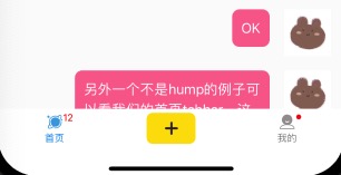
以上例子就是一个包含 三个tabItem,其中一个 tabItem 是弹窗形式的 自定义的tabbar。
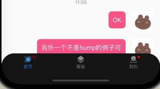
上面的tabbar包含了两个子组件,分别是 主页和我的。我们的 tabs 设置中设置了 三个tabItem。其中一个是 noPage 形式,也就是不占用子组件。
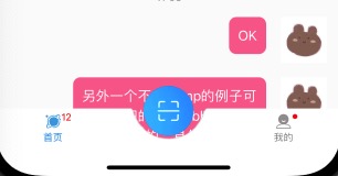
我们的 plus 组件对应的就是 noPage 设置。plus 组件是一个弹窗。您可以想象一下, 主页/我的,然后中间一个大大的 + 号。不管你处在哪个页面,点击这个 + 号都会弹出一个全屏的弹层,让您具备其它选择的能力。
这是很常用的一种设计。我想你也一定能 get 到这个意思。
tabbar 及其包裹的子组件定义了页面的内容,正如我们所看到的,他们都是在一个页面里面。我们需要管理当前处于哪个tab,又要去往哪个tab。
在 tabbar 外层的组件,一般都是一些 toast/loading/popup 之类等。毕竟 tabbar 会占满全屏。剩下的也只够您 弹出内容了。
使用 tabbar,最重要的就是:tabbar的UI适配,和 tabbar的功能跳转,以及 tab内容与页面之间的通信。
UI适配 #
对于 tabs的设置,我们提供了 tabStyle 这个全局的样式设置,也允许您在 tabs 中为某个tab做个性化的配置。
tabStyle #
统一样式配置入口。可配置的属性如下:
{
	iconStyle: 'font-size: 20px;color: #333232;',  // 图标样式,是icon字体的话,可以设置字体大小和颜色。一般我们用图片
	selectedIconStyle: 'font-size: 20px;color: #01A9F0;', // 选中时的icon样式,字体的话是大小和颜色
	titleStyle: '',  // tabitem的文字样式
	selectedTitleStyle: '',  // 选中是tabitem的文字样式
	boxStyle: '',  // tabs的外层style设置
	itemStyle: '',  // 每个item的外层style
	height: 50,  // tabbar的tabs高度。Number类型。px
	badgeStyle: '',  // badge为text时的外层style
	badgeTextStyle: '', // badge text的样式
	dotStyle: '',  // badge为dot时的style
	// we use it to help to position the badge or dot
	iconBoxWidth: '46px',  // 我们为图标设置一个盒子宽度,方便定位 badge。您的badge是依据此宽度来定位的
	image: null,  // 背景图片。一般我们只设置最上边的那个特殊弧度的背景
	imageStyle: '',  // 背景图片的样式
	imageBoxStyle: '', // 背景图片外层的样式
}
height 以及 iconBoxWidth 不设置的话,默认分别是 50 46px。没有什么是必须要设置的,您根据需要设置显示的内容。
tabs #
tabs 是一个数组,决策了 有多少个 tabs,以及他们各自的功能、定制化的样式。每个tabitem的具体配置如下:
{
	icon: '',  // 图标,一般是图片,可以是字体图标
	selectedIcon: '', // 选中时icon
	title: '',  // 文字
	selectedTitle: '',  // 选中时文字。为空表示选中时不显示文字
	badge: 0,  // badge 的数字
	dot: false,  // 是否显示成 dot 圆点
	isHump: false,  // 是否凸出。默认是 false
	noPage: false,  // 是否不在切换页面之中。默认是false
	humpStyle: '',  // 凸出的style。设置凸起宽高
	humpBottom: '',  // 凸起距离底部的距离,设置凸起偏移量
	iconStyle: '',  // 图标样式
	selectedIconStyle: '',  // 图标样式
	titleStyle: '',  // 文字样式
	selectedTitleStyle: '',  // 文字样式
	badgeStyle: '',  // badge外层样式
	badgeTextStyle: '',  // badge文字样式
	dotStyle: '',  // dot样式
	iconBoxWidth: ''  // 图标外层宽度,方便定位 badge/dot
}
具体的tabbar样子与适配代码,请看nPro的demo代码。


Props #
| Prop name | Description | Type | Values | Default |
|---|---|---|---|---|
| tabs | tabs 的内容以及个性化的配置。 isHump 表示是否凸起, noPage 表示点击当前 tab 时不切换,依然停留在原 tab 内容。 hump 具备 humpStyle,hump 有 humpBottom(就是距离底部的距离 px)。 icon,selectedIcon,title,selectedTitle, badge,dot, isHump,noPage,humpStyle,humpBottom iconStyle,selectedIconStyle,titleStyle,selectedTitleStyle, badgeStyle,badgeTextStyle,dotStyle,iconBoxWidth | array | - | |
| tabStyle | 全局 tabs 的样式设置。tabs 中可以单独设置进行覆盖 | object | - | { iconStyle: 'font-size: 20px;color: #333232;', selectedIconStyle: 'font-size: 20px;color: #01A9F0;', titleStyle: '', selectedTitleStyle: '', boxStyle: '', tabsStyle: '', itemStyle: '', height: 50, // px badgeStyle: '', badgeTextStyle: '', dotStyle: '', // we use it to help to position the badge or dot iconBoxWidth: '46px', image: null, imageStyle: '', imageBoxStyle: '', imageWidthXBar: false } |
| duration | 页面切换的动画周期 | number | - | 300 |
| timingFunction | 页面切换的动画函数 | string | - | 'cubic-bezier(0.25, 0.46, 0.45, 0.94)' |
| top | 距离顶部的距离 | string | - | '0' |
| isSeize | tabs 以及 xbar 的高度是否有占位 | boolean | - | true |
| considerXBar | 是否考虑 xbar | boolean | - | true |
| xBarBgType | xbar 的背景主题 | string | - | 'inverse' |
| xBarStyle | xbar 的样式 | string | - | '' |
Events #
| Event name | Properties | Description |
|---|---|---|
| tabClicked |
Slots #
| Name | Description | Bindings |
|---|---|---|
| default | ||
| bg | ||
| tabs |
事件跳转 #
我们对外提供了,next prev setPage 三个 ref method,用于您做程序内跳转。
next 与 prev 是 setPage 的便捷方法,我们一般不使用,主要还是使用 setPage。
setPage #
setPage(page, animated = true)
点击 tabitem,自动调用了该方法,该方法会帮您处理 内容子组件的切换,同时给您一个 tabClicked 通知。
您需要监听该通知 @tabClicked,来记录您的当前 tab number,以便实现更多的业务逻辑。该通知携带参数格式为:{page: 1}。
@tabClicked #
点击 tabitem,以及调用 setPage 都会触发 tabClicked 通知。该通知携带参数格式为:{page: 1}。
程序跳转 #
setPage(page, animated = true)
外部API接口跳转,请直接跳用该ref method。
- page 为当前的页码,从 0 开始,hump/noPage 也是计数的;
- animated 为是否需要动画效果,默认是开启的。
一般在哪里用到api跳转?
onLoad 里面,我们可能需要一个app打开,默认就处在 第二个 tabitem,这需要我们自己调用接口设置。
动态内容 #
动态内容,主要是指 tabitem 的动态,其中包括,tabitem的设置动态,以及 tabitem的数量动态。
动态tab内容 #
我们的 badge/dot 之类的东西,一般都是 动态的,您只需要恰当的处理好数据的变化就行。
您肯定有一些机制来让自己知道 badge/dot 改变了,随即去更新 tabs 的内容即可。
关于 tabitem 的样式动态,实际上也是可以的。您完全可以动态的改变样式属性配置,来实现动态的样式。
动态tab数量 #
有些人可能想实现,三个 tabitem 的页面,执行某个操作之后,页面变成 2个tabitem,比如 切换用户身份后,或者进入新的使用模式。
这也是可以的。不过我们并不建议在该 tabbar 页面直接改变,我们希望您 直接relaunch跳转到另一个具备不同 tabbar 的页面。
通信 #
由于 tabbar 是一个组件,各个页面的内容其实是 tabbar 的子组件,几个 tabitem 的内容其实都在 一个页面里面。也就是就只具备一个 onLoad onShow 等页面的生命周期,其它的的内容都是组件生命周期。
很多业务的处理可能都需要 移交到 具备页面生命周期的 那个承载页面 来做处理。
这就需要用到很多的通信或者通知监听。
常用的 父子组件通信/页面通信/全局变量 等方法都可以使用。
组件级emit/on #
有个时候,层次不是很高,我们可以直接使用 emit/on 进行父子组件事件通知与监听。
provide/inject #
使用 provide/inject 避开深层次的 emit/on。
watch/vuex #
有时候业务复杂,比如,用户登陆之后,各个 tabitem的内容都需要刷新,怎么办?
各自 watch vuex 中的同一个值,执行相应的业务逻辑。
全局 emit/on #
比如,我在某一个 发帖的页面,首页是一个帖子列表,我发帖之后需要刷新首页,怎么办?
可以使用 全局的 uni.$emit uni.$on。当然,记得在必要的时候 uni.$off。
其它设置 #
duration #
tab内容切换的动画周期,默认 300ms。
timingFunction #
tab内容切换的动画曲线,默认 cubic-bezier(0.25, 0.46, 0.45, 0.94)