tabs-h #
tabs-h 是直接基于 scroll-view 做的 横向可自动当前tab居中的 tabs滚动。一般用于 楼层内容与当前楼层指引,以及swiper等联动。
- 横向tabs;
- 支持自动居中当前tab;
- 支持滚动;
- 支持progress;
- 支持indicator;
- 支持indicator自动宽度;
- 支持图片indicator;
- 支持badge等;
<n-tabs-h :value="current" :isTap="true" :items="tabs1" :delay="50" width="200rpx" activeTextType="warning" indicatorType="warning" indicatorStyle="bottom:20rpx;" indicatorWidth="120rpx" @change="toChange1"></n-tabs-h>
<n-tabs-h :value="current5" :isTap="true" :hoverTop="false" :items="tabs5" :delay="50" activeTextType="error" left="24rpx" right="24rpx" justify="center" width="160rpx" height="120rpx" indicatorType="inverse" indicatorWidth="100rpx" indicatorHeight="100rpx" indicatorStyle="bottom:10rpx;" @change="toChange5">
	<image slot="indicator" src="/static/bg-circle.png" style="width: 100rpx;height: 100rpx;" mode="aspectFill"></image>
</n-tabs-h>
{
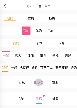
tabs1: ['我的','你的','Ta的'],
tabs2: [{title: '好人'},{title: '一生'},{title: '平安'}],
tabs3: ['一起','努力','加油','奋斗','争取','美好','未来','共建','幸福','家园','享受','快乐','人生'],
tabs4: ['我们','一起','把家还','好吗','可不可以','要不要得','好的','收到','同意'],
tabs5: ['订制','指示器','舒服'],
tabs6: [{name: '我的'}, {name: '角标', badge: {bgType: 'error',size: '18rpx',text: '',boxStyle: 'position:absolute;top:24rpx;right:24rpx;'}}, {name: '好看'}]
}
Props #
| Prop name | Description | Type | Values | Default |
|---|---|---|---|---|
| items | tabs 内容 | array | - | [] |
| value | 当前 index | number | - | 0 |
| last | 联动时需要。因为 scroll 的过程中,current 就会发生变化, 我们需要用另外一个来记录 | number | - | 0 |
| textLabel | 文字内容的字段 | string | - | null |
| offset | 联动时 swiper 的偏移量。px. swiperScroll dx | number | - | 0 |
| swiperWidth | swiper 的宽度。联动时需要 | string | - | '750rpx' |
| isTap | 是否是点击 tab。不联动时一直设置为 true | boolean | - | false |
| justify | justify 主题。center 或者 end 的时候,请注意 items 的数量不要超过总尺寸 | string | - | 'start' |
| scrollSize | scroll 的自定义宽度 | string | - | '750rpx' |
| textSize | 文字的尺寸主题 | string | - | 'base' |
| activeTextSize | 当前项文字的尺寸主题 | string | - | 'base' |
| bgType | 背景主题 | string | - | 'inverse' |
| textType | 文字颜色主题 | string | - | '' |
| activeTextType | 当前项的文字颜色主题 | string | - | '' |
| height | 自定义高度 | string | - | '80rpx' |
| width | tab 项的宽度。0 的时候,自适应宽度 | string | - | '120rpx' |
| left | 左侧空白占位 | string | - | '0' |
| right | 右侧空白占位 | string | - | '0' |
| space | 各个 tab 之间的间隙 | string | - | '0px' |
| border | 边框主题 | string | - | '' |
| badgeConfig | badge 配置信息 | object | - | {} |
| hasIndicator | 是否有底下指示器 | boolean | - | true |
| indicatorType | 指示器的背景主题 | string | - | 'primary' |
| indicatorWidth | 指示器的自定义宽度。0 的时候动态宽度,自适应宽度 | string | - | '80rpx' |
| indicatorHeight | 指示器的自定义高度 | string | - | '5rpx' |
| indicatorRadius | 指示器的自定义圆角 | string | - | '4rpx' |
| absIndicator | indicator 是否绝对定位 | boolean | - | true |
| boxStyle | 外层样式,也是 scroll 的样式 | string | - | '' |
| tabsStyle | tabs 的内容样式 | string | - | '' |
| textStyle | 文字样式 | string | - | '' |
| activeTextStyle | 当前项的文字样式 | string | - | '' |
| itemStyle | tab 项的样式 | string | - | '' |
| activeItemStyle | 当前项的 tab 样式 | string | - | '' |
| indicatorStyle | 指示器的样式 | string | - | '' |
| updateTime | 通过改变该值触发位置的重新计算。 主要是为了兼容各大平台位置获取的时机问题。 在弹层里面,items 能够很快拿到, 但是不一定位置信息就可以立马拿到 | number | - | 0 |
| delay | 延迟获取元素内容, 只影响 mounted 里面的调用, -1 表示不延迟。 其他情况使用 updateTime | number | - | -1 |
| updateDelay | 延迟获取元素内容, 只影响 items 改变时的调用, -1 表示不延迟。 其他情况使用 updateTime | number | - | -1 |
| hoverTop | indicator 是否在最上层 | boolean | - | false |
Events #
| Event name | Properties | Description |
|---|---|---|
| change |
Slots #
| Name | Description | Bindings |
|---|---|---|
| indicator |
说明 #
scroll-view 在scroll-x为true时,设置scroll-y为false,会导致部分平台在x方向无法滚动。如果您发现您的scroll-x为true,但是无法滚动,请检查是不是设置了scroll-y。
使用 #
<n-tabs-h :value="current" :isTap="true" :items="tabs" activeType="error" indicatorType="error" @change="toChangeTab"></n-tabs-h>
因为我们的 tabs 还支持在 swiper 滑动的过程中,indicator也跟随滑动,故而加了 isTap,在普通使用的时候,需要总是设置 :isTap="true"。
如果您点击tab无法正确响应,请检查是否开启了 isTap。
value就是当前的tab index值,类似于 swiper中的current,items就是tabs的内容,可以直接是 ['a', 'b', 'c'] 这种,也支持自定义的label。
然后就是一些 indicator 的设置,以及 事件通知。
tabs-h在使用的过程中,建议:要么您的item的宽度固定,要么active时与普通状态时宽度一样。后面会解释为什么
盒子与内容 #
一个是 tabs的整体盒子设置,另外就是 tabs的 items设置。
scrollSize justify bgType border boxStyle
items value textLabel height width space tabsStyle
textSize activeTextSize textType activeTextType textStyle activeTextStyle itemStyle activeItemStyle
其实这些属性,只是看名字,您就能知道是什么意思,分别对应什么方面的设置,尤其是你用过几个组件之后,你会越来越熟悉,用起来越来越顺手。
scrollSize #
tabs-h 的最外层是一个 scroll-view。
scroll-view 的宽度,因为是横向滚动,必须设置宽度,单位随意。默认 750rpx。
justify #
内容在 scroll-view 中的排布方式。可以使用 center between end。
在使用非 start 布局的时候,您应该满足您的items的宽度不能超过 scrollSize 的宽度。
bgType #
scroll-view 的背景主题色。
border #
scroll-view 的border配置。比如:border="bottom" border="bottom-primary"。
boxStyle #
scroll-view 的style设置。
items #
tab items的内容,数组Array类型。默认支持直接的 ['a', 'b', 'c'] 设置。
也支持每一个 item 是Object。数据可以有自己的label。比如:[{name: 'a'}, {name: 'b'}, {name: 'c'}]。
Object类型的时候,您必须设置 textLabel 告知组件使用哪个label的数据。比如:textLabel="name"。
value #
当前 tab 的index值。我们不再支持 v-model 绑定。index 从0开始。
textLabel #
当 items 里面的 item 是 Object 的时候,您需要告知组件使用 哪个key的数据。比如:[{name: 'a'}, {name: 'b'}, {name: 'c'}],您显示 name 中的数据,就需要设置 textLabel="name"。
height #
tabs item 的高度。不是scss中定义的那个height设置。是需要设置具体数值的设置,单位随意。默认 80rpx。
width #
tabs item 的宽度。单位随意。默认 120rpx。可以是 0,0表示 自适应内容宽度。
space #
tabs item 的左右间距便捷设置。默认是 0。单位随意。对应在每个 item 里面就是 margin-left/margin-right。
tabsStyle #
tabs 整体内容的 style设置。如果 boxStyle 设置了 padding属性,我们建议您在 tabsStyle 中设置同样的padding。否则 indicator的位置计算 可能出现问题。
建议您不要设置 padding 属性。如果您的 indicator 位置不达到预期,请检查 padding 相关的设置。
textSize #
tabs item 的文字 尺寸主题配置,其值是 scss中定义的变量:ss s base l ll。默认是 base。
activeTextSize #
当前 tabs item 的文字 尺寸主题配置,其值是 scss中定义的变量:ss s base l ll。默认是 base。
textType #
tabs item 的文字 颜色主题配置,默认是 text,也就是 n-color-text。
activeTextType #
当前 tabs item 的文字 颜色主题配置,默认是 text,也就是 n-color-text。
textStyle #
tabs item 的文字style。
activeTextStyle #
当前 tabs item 的文字style。
itemStyle #
tabs item 的style。
activeItemStyle #
当前 tabs item 的style。
indicator设置 #
底下指示栏设置:
hasIndicator indicatorType indicatorWidth indicatorHeight indicatorRadius indicatorStyle
hasIndicator #
默认 true,也就是 具备 indicator.
indicatorType #
indicator 的背景色主题,默认 primary。
indicatorWidth #
indicator的宽度设置,单位随意,默认 80rpx。可以设置为0,表示:自适应内容宽度。
indicatorHeight #
indicator的高度设置,单位随意,默认 4rpx。
indicatorRadius #
indicator的 border-radius 设置,单位随意,默认 4rpx。
indicatorStyle #
indicator的style。
indicator与swiper联动 #
有时候,我们可能想要 indicator的移动与swiper的滑动联动起来。我们提供了联动的属性配置,以及联动时需要在swiper内容处处理的mixin。
last offset swiperWidth isTap
swiper 内容处对应的mixin在 /nPro/tabs-h/tabsSwiperMixin.js 中。
具体的使用,可以看 nPro 的 demo中swiper 相关。
last #
实际上,我们在swiper滑动的过程中 current tab值就会发生改变(也就是 value 会发生改变,而这个时候我们的手势还在继续滑动,从而我们无法直接使用 value 属性。我们需要一个别的值来标记当前手势所在的 index),所以我们用一个 额外的变量 来记录 index,表征手势拖动所在的index。
offset #
对应swiper中的 @transition 的dx。
swiperWidth #
设置 swiper的width。这样我们才能知道 indicator 需要走多少。
isTap #
isTap 决策是否是 点击了tabs-item。默认是关闭的。使用 普通模式(也就是不使用联动的时候)时,您必须打开它,设置为 true。
如果您的tabs点击无法有预期的效果,请检查 isTap 属性