grid-static #
grid-static 宫格
- 允许图文;
- 允许全文字;
- 允许分割线;
- 允许单独配置某一个项;
主要属性有:
- items,内容,其中iconLabel,textLabel设置icon与text对应的字段;
- columns,每一行多少个;
- mode,每个item的布局方式,有top/left/right/bottom;
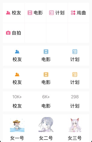
<n-grid-static :hasLine="false" border="none" :items="itemsTwo" :columns="3" iconLabel="icon" iconType="primary" textLabel="name" itemHeight="160rpx" boxStyle="margin-left:32rpx;margin-right:32rpx;background-color:#FFFFFF;"></n-grid-static>
<n-grid-static :hasLine="false" border="none" :items="itemsThree" :columns="3" :isIcon="false" iconLabel="icon" iconType="third" iconSize="ll" textLabel="name" space="24rpx" itemHeight="160rpx" boxStyle="margin-left:32rpx;margin-right:32rpx;background-color:#FFFFFF;"></n-grid-static>
{
	itemsTwo: [{icon: 'club',name: '校友'}, {icon: 'film',name: '电影'}, {icon: 'task',name: '计划'}],
	itemsThree: [{icon: '10K+',name: '校友'}, {icon: '6K+',name: '电影'}, {icon: '298',name: '计划'}]
}
Props #
| Prop name | Description | Type | Values | Default |
|---|---|---|---|---|
| items | 数据源 | array | - | [] |
| mode | grid-item 的布局方式 | string | - | 'top' |
| columns | 每一行的数量 | number | - | 4 |
| itemHeight | 自定义的高度 | string | - | '' |
| hasLine | 是否带有分割线 | boolean | - | true |
| space | grid-item 的 space | string | - | '12rpx' |
| textType | item 的文字颜色主题 | string | - | '' |
| textSize | item 的文字尺寸主题 | string | - | '' |
| iconType | item 的图标颜色主题 | string | - | '' |
| iconSize | item 的图标尺寸主题 | string | - | 'll' |
| border | 边框主题 | string | - | '' |
| radius | 圆角主题 | string | - | '' |
| hover | hover 主题 | string | - | 'opacity' |
| iconLabel | item 的 icon 字段 | string | - | 'icon' |
| textLabel | item 的 text 字段 | string | - | 'text' |
| isIcon | item 的 icon 是否是图标 | boolean | - | true |
| badgeConfig | badge 样式的全局配置 | object | - | {} |
| boxStyle | 外层样式 | string | - | '' |
| itemBoxStyle | item 的外层样式 | string | - | '' |
| iconStyle | 图标样式 | string | - | '' |
| iconBoxStyle | 图标的外层样式 | string | - | '' |
| textStyle | 文字样式 | string | - | '' |
Events #
| Event name | Properties | Description |
|---|---|---|
| itemClicked |