progress #
progress
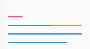
进度条组件。
- 具体自己设置style,可以实现各种效果,比如渐变/动画等。
<n-progress :progress="0.2" progressBgType="error" boxStyle="margin-left:75rpx;"></n-progress>
Props #
| Prop name | Description | Type | Values | Default |
|---|---|---|---|---|
| progress | 进度。0-1 | number | - | 0 |
| width | 自定义宽度 | string | - | '600rpx' |
| height | 自定义高度 | string | - | '12rpx' |
| bgType | 背景主题 | string | - | 'light' |
| progressHeight | 进度条的自定义高度 | string | - | '12rpx' |
| progressBgType | 进度条的背景主题 | string | - | 'primary' |
| boxStyle | 外层样式 | string | - | '' |
| progressStyle | 进度条的样式 | string | - | '' |