item #
item 快捷上下结构小单元
- 支持上下左右模式;
- 支持图文与纯文字;
主要属性有:
- icon,图标或者图片;
- isIcon,是否是图标或者图片;
- text,文字;
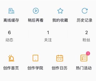
<view class="n-flex-row">
	<n-item v-for="(item,idx) in items" :key="idx" :icon="item.icon" :text="item.name" textType="text" iconType="primary" iconStyle="font-size: 46rpx;" space="20rpx" style="flex: 1;" boxStyle="flex:1;height:180rpx;"></n-item>
</view>
<view class="n-flex-row n-justify-between" style="height:140rpx">
	<n-item icon="6" :isIcon="false" text="动态" boxStyle="width:160rpx; height: 100rpx;"></n-item>
	<view class="ms-split"></view>
	<n-item icon="1" :isIcon="false" text="关注" boxStyle="width:160rpx; height: 100rpx;"></n-item>
	<view class="ms-split"></view>
	<n-item icon="2" :isIcon="false" text="粉丝" boxStyle="width:160rpx; height: 100rpx;"></n-item>
</view>
<n-item v-for="(item,idx) in items2" :key="idx" :icon="item.icon" :text="item.name" textType="text" iconType="warning" iconStyle="font-size: 52rpx;" space="20rpx" boxStyle="width:187rpx;height:180rpx;">
	<n-badge v-if="item.badge" :text="item.number" size="32rpx" boxStyle="position:absolute;right:46rpx;top:8rpx;"></n-badge>
</n-item>
Props #
| Prop name | Description | Type | Values | Default |
|---|---|---|---|---|
| icon | 图标/图片/文字 | string | - | '' |
| isIcon | 是否是图标 | boolean | - | true |
| text | 文字 | string | - | '' |
| space | 图标与文字的间距 | string | - | '12rpx' |
| bgType | 背景主题 | string | - | '' |
| border | 边框主题 | string | - | '' |
| radius | 圆角主题 | string | - | '' |
| hover | hover 主题 | string | - | 'opacity' |
| iconType | 图标颜色主题 | string | - | 'text' |
| iconSize | 图标尺寸主题 | string | - | 'll' |
| iconStyle | 图标样式 | string | - | '' |
| iconBoxStyle | 图标外层样式 | string | - | '' |
| textType | 文字颜色主题 | string | - | 'second' |
| textSize | 文字尺寸主题 | string | - | 'base' |
| textStyle | 文字样式 | string | - | '' |
| boxStyle | 外层样式 | string | - | '' |
Events #
| Event name | Properties | Description |
|---|---|---|
| itemClicked |
Slots #
| Name | Description | Bindings |
|---|---|---|
| default |