loading #
loading 加载中弹窗
<n-loading ref="n-loading"></n-loading>
// 带遮罩层打开
this.$refs['n-loading'].show({needMask: true})
// 关闭
setTimeout(()=>{
	this.$refs['n-loading'].hide()
}, 2000)
Props #
| Prop name | Description | Type | Values | Default |
|---|---|---|---|---|
| maskStyle | 遮罩层样式 | string | - | '' |
| boxStyle | 外层样式 | string | - | '' |
| baseHeight | 基准高度 | string | - | 'window' |
| baseWidth | 基准宽度 | string | - | '750rpx' |
| width | 内容宽度 | string | - | '200rpx' |
| height | 内容高度 | string | - | '200rpx' |
Events #
| Event name | Properties | Description |
|---|---|---|
| maskClicked |
说明 #
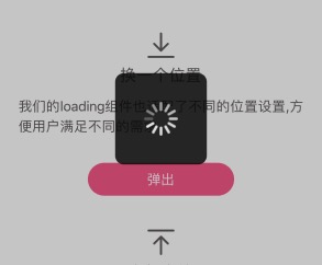
loading组件在组件上面,并没有开放太多的配置内容,大多数配置都是开放在实例下。
她的show方法支持配置参数:
{
	pos: 'center',
	offset: '0',
	needMask: false,
	maskType: '',
	maskStyle: '',
	bgType: '',
	icon: '',
	text: '',
	iconStyle: '',
	textType: '',
	textSize: '',
	textStyle: '',
	contentStyle: '',
	delay: 0,
}
这样我们就允许,一个实例弹出不同的loading效果。