notice #
notice 提示
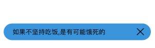
采用 icon-text-indicator 三段式的设计。内置closable,支持打开/关闭。
<n-notice ref="n-notice" bgType="primary" icon="hint" text="如果不坚持吃饭,是有可能饿死的" indicator="close" radius="ll" :closable="true"></n-notice>
this.$refs['n-notice'].show()
Props #
| Prop name | Description | Type | Values | Default |
|---|---|---|---|---|
| icon | 左侧图标 | string | - | null |
| text | 文字内容 | string | - | '' |
| indicator | 右侧图标 | string | - | null |
| bgType | 背景主题 | string | - | '' |
| height | 高度主题 | string | - | 'base' |
| border | 边框主题 | string | - | '' |
| radius | 圆角主题 | string | - | '' |
| textType | 文字颜色主题 | string | - | '' |
| textSize | 文字尺寸主题 | string | - | 'base' |
| iconType | 图标主题 | string | - | '' |
| iconSize | 图标尺寸主题 | string | - | 'll' |
| iconStyle | 图标样式 | string | - | '' |
| indicatorType | 右侧图标颜色主题 | string | - | '' |
| indicatorSize | 右侧图标尺寸主题 | string | - | 'll' |
| indicatorStyle | 右侧图标样式 | string | - | '' |
| space | 间距 | string | - | '12rpx' |
| textStyle | 文字样式 | string | - | '' |
| boxStyle | 外层样式 | string | - | '' |
| iconBoxStyle | 图标外层样式 | string | - | '' |
| indicatorBoxStyle | 右侧图标外层样式 | string | - | '' |
| closable | 是否可以关闭 | boolean | - | false |
Events #
| Event name | Properties | Description |
|---|---|---|
| noticeClicked | ||
| indicatorClicked |