popup-always #
popup-always里面的内容只会创建一次,里面不受v-if控制。用途如下:
初始化/创建成本较高的内容;
希望弹窗里面的内容只创建一次;
需要事先露出一小截;
...
pos,
topleftbottomrighttop-centerleft-centerbottom-centerright-center;height,内容高度(当然可以自适应内容高度:全屏高度,然后利用flex布局来排布内容即可);
width,内容宽度;
show,通过show来控制打开与关闭。初始化的时候必须为false;
standout,提前露出的一部分高度;
<template>
	<n-popup-always :show="show" pos="top" top="status-nav" height="300px" @overlayClicked="toClose">
		<view class="ndp">
			<n-tag-group :limits="1" :leastOne="true" :items="items" :value="[current.id]" :column="3" textLabel="title" valueLabel="id" tagSelectedBgType="primary" tagSelectedTextType="inverse" columnSpace="24rpx" rowSpace="24rpx" boxStyle="margin-top:24rpx;margin-left:32rpx;margin-right:32rpx;" @change="toSelect"></n-tag-group>
		</view>
	</n-popup-always>
</template>

<script>
	export default {
		props: {
			show: {
				type: Boolean,
				default: false
			},
			current: {
				type: Object,
				default: ()=>{
					return {}
				}
			}
		},
		data() {
			return {
				items: [
					{id: 0, title: '全部心情'}, {id: 1, title: '开心'}, {id: 2, title: '愤怒'}, {id: 3, title: '伤心'}, {id: 4, title: '沮丧'}, {id: 5, title: '狂喜'}, {id: 6, title: '暴躁'}, {id: 7, title: '心塞'}
				]
			}
		},
		methods: {
			toSelect(val) {
				if (val.length === 0) {
					this.$emit("select", this.items[0])
				} else {
					for (const i in this.items) {
						const theI = this.items[i]
						if (theI.id === val[0]) {
							this.$emit("select", theI)
							return
						}
					}
				}
			},
			toClose() {
				this.$emit("cancel")
			}
		}
	}
</script>

<style lang="scss" scoped>
	.ndp {
		height: 300px;
		width: 750rpx;
		background-color: #FFFFFF;
	}
</style>

Props #
| Prop name | Description | Type | Values | Default |
|---|---|---|---|---|
| show | 是否打开/展示 | boolean | - | false |
| pos | 定位位置 | string | - | 'bottom' |
| bgType | 背景主题 | string | - | '' |
| duration | 动画周期 | number | - | 300 |
| overlay | 遮罩层设置 | object | - | timingFunction: ['ease-in', 'ease-out'], duration: 300, bg: '', bgType: 'mask' |
| animation | 动画函数 | object | - | timingFunction: 'ease-out' |
| baseWidth | 基准宽度 | string | - | '750rpx' |
| baseHeight | 基准高度 | string | - | 'window' |
| width | 自定义宽度 | string | - | '750rpx' |
| height | 自定义高度 | string | - | '0' |
| standout | 提前显示在可见屏幕内的高度 | string | - | '0' |
| hasOverlay | 是否具备遮罩层 | boolean | - | true |
| leftOffset | 内容与屏幕左侧的距离 | string | - | '-1' |
| rightOffset | 内容与屏幕右侧的距离 | string | - | '-1' |
| bottomOffset | 内容与屏幕底部的距离 | string | - | '-1' |
| topOffset | 内容与屏幕顶部的距离 | string | - | '-1' |
| left | 遮罩与屏幕左侧的距离 | string | - | '0' |
| top | 遮罩与屏幕顶部的距离 | string | - | '0' |
| right | 遮罩与屏幕右侧的距离 | string | - | '0' |
| bottom | 遮罩与屏幕底部的距离 | string | - | '0' |
| initWithAni | 是否具备初始动画 | boolean | - | true |
| initDelay | 初始动画的延时 | number | - | 200 |
| initDuration | 初始动画的周期 | number | - | 300 |
| boxStyle | 内容外层样式 | string | - | '' |
Events #
| Event name | Properties | Description |
|---|---|---|
| overlayClicked |
Slots #
| Name | Description | Bindings |
|---|---|---|
| overlay | ||
| default |
说明 #
popup-always 几乎是与 popup 一样的,属性一样,用法一样。
他们之间的区别在于:
popup-always 里面的内容不受 v-if 控制,会一直存在于 视图 之中,而 popup 的内容区是 受 v-if 控制的;
popup-always 因为一直存在,所以它支持 standout 属性,允许 不打开的时候还能够 对外露出一小截;
standout #
允许对外露出一小截内容,standout 就是对外露出的高度。单位随意,默认 rpx。
用途 #
除了实现 standout 外,popup-always 还能有什么用?
这个问题,其实就是:为什么要有 popup popup-always 两个组件?
除了上面说过的 standout 特性。我们主要考虑的是:
popup 内容是 v-if 控制的,它可能在打开的时候永远在其它视图之上,而有个时候我们需要它处于某个视图的下面,比如从页面顶部弹出内容的时候,我们希望,它处于自定义导航栏的下面,而不是在自定义导航栏的上面。这个时候 popup 做不到。
所以,popup-always 的存在,很大程度上是为了业务的需要,其实也是视图层级机制的需要。
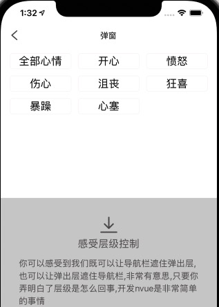
我们在制作 筛选filter 的时候,经常需要 上面的总览条件不被遮挡,下面的具体filter内容具备弹层效果,popup-always 就能够很好的帮助到您。
popup-always 能够自由 可控的 调整其在视图中的层级。想要他处于某个元素的下面或者上面都可以轻易的做到。
这样navbar就始终在弹层的上面
<template>
  <view>
    <n-popup-always></n-popup-always>
    <n-navbar :fixed="true" :isSeize="false"></n-navbar>
  </view>
</template>
这样navbar就始终在弹层的下面
<template>
  <view>
    <n-navbar :fixed="true" :isSeize="false"></n-navbar>
    <n-popup-always></n-popup-always>
  </view>
</template>