toast #
toast 是非常优秀的一个 toast 组件。
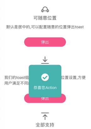
- 支持 toast 内容显示在不同的位置;
- 支持 toast 设置图标/文字/内容/背景色,以及大小等样式;
- 支持统一配置,支持个性化配置;
<template>
  <view>
    <n-toast ref="n-toast"></n-toast>
  </view>
</template>

<script>
export default {
	methods: {
		toShowToast() {
			this.$refs['n-toast'].show({
				text: '发布成功',
				type: 'success',
				mode: 'big'
			})
		}
	}
}
</script>
toast采用的是传递配置参数的形式来适配的,允许每一次都弹出不同的样式。
可配置参数如下:
{
	needMask: false,  // 是否显示遮罩层
	maskType: 'mask',  // 遮罩层的背景主题
	maskStyle: '',  // 遮罩层自定义样式
	pos: 'center',   // top/center/bottom
	offset: '0',     // 对pos的微调,可为status/nav-status/status-nav/x/80rpx/...
	mode: 'small',   // 模式,big/small. big is big icon, small is small icon
	type: '',  // 显示的主题或者含义,可为primary/success/warning/error/default
	bgType: '',  // 内容背景主题
	icon: '',  // 自定义图标
	text: '',  // 显示的文字
	textType: 'inverse',  // 文字颜色主题
	textSize: 'base',  // 文字尺寸主题
	iconType: 'inverse',  // 图标颜色主题
	iconSize: 'll',  // 图标尺寸主题
	contentStyle: '',  // 内容的样式
	iconStyle: '',  // 图标的样式
	textStyle: ''  // 文字的样式
}
Props #
| Prop name | Description | Type | Values | Default |
|---|---|---|---|---|
| boxStyle | 外层样式 | string | - | '' |
| baseWidth | 基准宽度 | string | - | '750rpx' |
| baseHeight | 基准高度 | string | - | 'window' |