button #
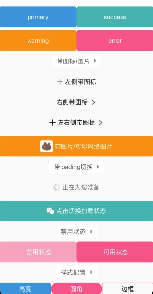
button 按钮
基于 icon-text-icon2 的设计,满足各种不同设计的按钮样式。
- icon,左侧图标;
- text,文字内容;
- icon2,右侧图标;
- 支持disabled和loading效果;
<n-button bgType="primary" textType="inverse" border="none" text="primary"></n-button>
<n-button icon="add" icon2="arrow-right" text="左右侧带图标"></n-button>
<n-button bgType="warning" icon="/static/bear.jpg" iconStyle="width: 60rpx; height: 60rpx; border-radius:8rpx;" text="带图片/可以网络图片" textType="inverse" border="none"></n-button>
Props #
| Prop name | Description | Type | Values | Default |
|---|---|---|---|---|
| bgType | 背景主题 | string | - | '' |
| text | 文字内容 | string | - | '' |
| icon | 左侧图标 | string | - | '' |
| icon2 | 右侧图标 | string | - | '' |
| loading | 是否为 loading 状态 | boolean | - | false |
| loadingSrc | loading 状态时显示的图片 | string | - | '/static/ui/loading.gif' |
| height | 高度主题 | string | - | 'l' |
| hover | 点击时的 hover 效果: opacity/bg/bg-opacity | string | - | 'opacity' |
| radius | 圆角主题 | string | - | 'base' |
| border | 边框主题 | string | - | '' |
| disabled | 是否为禁用状态。禁用时不可点击 | boolean | - | false |
| space | 文字与图标之间的间距 | string | - | '12rpx' |
| textType | 文字颜色主题 | string | - | 'text' |
| textSize | 文字尺寸主题 | string | - | 'base' |
| iconType | 左侧图标颜色主题 | string | - | 'text' |
| iconSize | 左侧图标尺寸主题 | string | - | 'l' |
| icon2Type | 右侧图标颜色主题 | string | - | 'text' |
| icon2Size | 右侧图标尺寸主题 | string | - | 'l' |
| boxStyle | 外层样式 | string | - | '' |
| textStyle | 文字样式 | string | - | '' |
| iconBoxStyle | 左侧图标外层样式 | string | - | '' |
| iconStyle | 左侧图标样式 | string | - | '' |
| icon2BoxStyle | 右侧图标外层样式 | string | - | '' |
| icon2Style | 右侧图标样式 | string | - | '' |
| loadingWidth | loading 图标的宽度 | string | - | '36rpx' |
| loadingHeight | loading 图标的高度 | string | - | '36rpx' |
Events #
| Event name | Properties | Description |
|---|---|---|
| buttonClicked |
Slots #
| Name | Description | Bindings |
|---|---|---|
| default | ||
| extra |
原生按钮 #
在开发小程序的时候,我们难免会用到小程序原生按钮。
这个时候,我们需要注意的是:原生按钮可能会带有padding/margin/border等。我们往往不需要这些东西。
而border的配置是在:after下的。我们适配如下:
<style lang="scss" scoped>
	.n-btn-raw {
		/* #ifndef APP-NVUE */
		padding: 0;
		margin: 0;
		/* #endif */
		/* #ifdef APP-NVUE */
		padding-left: 0;
		padding-right: 0;
		padding-top: 0;
		padding-bottom: 0;
		margin-left: 0;
		margin-top: 0;
		margin-bottom: 0;
		margin-right: 0;
		/* #endif */

		/* #ifndef APP-NVUE */
		&:after {
			border: none;
		}
		/* #endif */
	}
</style>