picker #
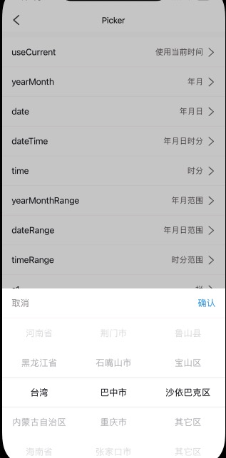
picker 选择器组件
我们默认只打开了3级选择。更多的请看我们自定义的pca(省市区联动选择)组件。
picker其实就是picker-content在popup中的封装。
主要内容有:头部和picker-content区。
主要设置属性有:
- mode,几级选择,s1/s2/s3;
- value,初始值,['李白']。需要注意的是,这个不是索引,而是直接值;
- selections,可选择项;
- labelProps, 自定义的相应内容对应字段,也就是需要显示的内容在选择项里面对应的字段;
<n-picker :show="s3Visible" :value="s3Val" :selections="pcas" mode="s3" :labelProps="labelTags" @cancel="toHideS" @confirm="toConfirmS3"></n-picker>
{
	labelTags: {
		s1: {
			label: 'name',
			value: 'code'
		},
		s2: {
			label: 'name',
			value: 'code',
			// the tag is for to get s2 selections in s1
			tag: "cities"
		},
		s3: {
			label: 'name',
			value: 'code',
			tag: 'areas'
		}
	}
}
Props #
| Prop name | Description | Type | Values | Default |
|---|---|---|---|---|
| show | 是否打开/显示 | boolean | - | false |
| mode | s1/s2/s3 | string | - | 'date' |
| cancelText | 左侧取消文字 | string | - | '取消' |
| confirmText | 右侧确认文字 | string | - | '确认' |
| title | 中间标题 | string | - | '' |
| cancelType | 取消文字颜色主题 | string | - | 'third' |
| cancelSize | 取消文字尺寸主题 | string | - | 'base' |
| cancelStyle | 取消文字样式 | string | - | '' |
| confirmType | 确认文字颜色主题 | string | - | 'primary' |
| confirmSize | 确认文字尺寸主题 | string | - | 'base' |
| confirmStyle | 确认文字样式 | string | - | '' |
| titleType | 标题颜色主题 | string | - | 'text' |
| titleSize | 标题尺寸主题 | string | - | 'base' |
| titleStyle | 标题样式 | string | - | '' |
| headerBorder | 头部的边框主题 | string | - | 'bottom' |
| headerRadius | 头部的圆角主题 | string | - | 'top-base' |
| headerBgType | 头部的背景主题 | string | - | 'inverse' |
| headerStyle | 头部样式 | string | - | '' |
| value | 值,不是索引 | array | - | [0,0,0,0,0,0,0] |
| bgType | content 的背景色主题 | string | - | 'inverse' |
| textType | content 的文字颜色主题 | string | - | 'text' |
| textSize | content 的文字尺寸主题 | string | - | 'base' |
| height | content 的自定义高度 | string | - | '500rpx' |
| itemHeight | 选择 item 的自定义高度 | string | - | '100rpx' |
| boxStyle | content 的外层样式 | string | - | '' |
| itemStyle | 选择 item 的外层样式 | string | - | '' |
| textStyle | 选择 item 的文字样式 | string | - | '' |
| indicatorStyle | content 的 indicator-style | string | - | '' |
| selections | 可选择内容 | array | - | [] |
| labelProps | 自定义的相应内容对应字段 | object | - | { s1: { label: 'name', value: 'id' }, s2: { label: 'name', value: 'id', // the tag is for to get s2 selections in s1 tag: "c" }, s3: { label: 'name', value: 'id', // the tag is for to get get s3 in selections in s2 tag: "a" } } |
Events #
| Event name | Properties | Description |
|---|---|---|
| confirm | ||
| cancel |
Slots #
| Name | Description | Bindings |
|---|---|---|
| header |
n-picker-content #
Props #
| Prop name | Description | Type | Values | Default |
|---|---|---|---|---|
| mode | ['s3', 's2', 's1'] | string | - | "s1" |
| value | 值,不是索引 | array | - | [0,0,0] |
| bgType | 背景主题 | string | - | 'inverse' |
| textType | 选择项文字颜色主题 | string | - | 'text' |
| textSize | 选择项文字尺寸主题 | string | - | 'base' |
| height | 自定义的高度 | string | - | '500rpx' |
| itemHeight | 选择项自定义的高度 | string | - | '100rpx' |
| boxStyle | 外层样式 | string | - | '' |
| itemStyle | 选择项的外层样式 | string | - | '' |
| textStyle | 选择项的文字样式 | string | - | '' |
| indicatorStyle | indicator-style | string | - | '' |
| selections | 选择的内容 | array | - | [] |
| labelProps | 对应选择内容的字段 | object | - | { s1: { label: 'name', value: 'id' }, s2: { label: 'name', value: 'id', // the tag is for to get s2 selections in s1 tag: "c" }, s3: { label: 'name', value: 'id', // the tag is for to get get s3 in selections in s2 tag: "a" } } |
Events #
| Event name | Properties | Description |
|---|---|---|
| inited | ||
| change |