select-line #
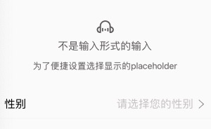
select-line 非input输入的选择行。为了快速设置placeholder,以及与input一致的设置体验
采用 icon-label-value-indicator 四段式的设计。
<n-select-line label="性别" :value="sex===1?'男':(sex===2?'女':'')" border="bottom" placeholder="请选择您的性别" indicator="arrow-right" boxStyle="padding-left:32rpx;padding-right:32rpx;" @selectClicked="toSelectSex"></n-select-line>
Props #
| Prop name | Description | Type | Values | Default |
|---|---|---|---|---|
| icon | 左侧图标 | string | - | '' |
| label | 标签 | string | - | "" |
| value | 值 | string | - | '' |
| indicator | 右侧图标 | string | - | '' |
| height | 高度主题 | string | - | "l" |
| border | 边框主题 | string | - | '' |
| radius | 圆角主题 | string | - | '' |
| placeholder | placeholder | string | - | "请选择" |
| valueAlign | 内容排版方式 | string | - | "right" |
| bgType | 背景主题 | string | - | '' |
| iconType | 左侧图标颜色主题 | string | - | '' |
| iconSize | 左侧图标尺寸主题 | string | - | 'l' |
| valueType | 内容颜色主题 | string | - | '' |
| valueSize | 内容尺寸主题 | string | - | "" |
| labelType | 标签颜色主题 | string | - | '' |
| labelSize | 标签尺寸主题 | string | - | '' |
| placeType | 占位颜色主题 | string | - | 'place' |
| placeSize | 占位尺寸主题 | string | - | '' |
| indicatorType | 右侧图标颜色主题 | string | - | 'third' |
| indicatorSize | 右侧图标尺寸主题 | string | - | 'l' |
| space | 各元素间距 | string | - | '12rpx' |
| hover | hover 主题 | string | - | 'bg' |
| boxStyle | 外层样式 | string | - | '' |
| labelStyle | 标签样式 | string | - | '' |
| valueStyle | 内容样式。默认铺满 | string | - | 'flex:1;' |
| placeStyle | 占位内容样式 | string | - | 'flex:1;' |
| indicatorStyle | 右侧图标样式 | string | - | '' |
| iconBoxStyle | 左侧图标外层样式 | string | - | '' |
| indicatorBoxStyle | 右侧图标外层样式 | string | - | '' |
Events #
| Event name | Properties | Description |
|---|---|---|
| selectClicked |
Slots #
| Name | Description | Bindings |
|---|---|---|
| label | ||
| default | ||
| extra |