check-static #
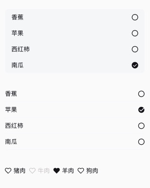
check-static 有限自定义的单多选
<n-check-static v-model="model" icon="circle" checkedIcon="check-solid" :items="items1" direction="right" :isBetween="true" itemBoxStyle="background-color:#F5F7F9;padding-left:32rpx;padding-right:32rpx;" boxStyle="border-radius:16rpx;overflow:hidden;"></n-check-static>
<n-check-static v-model="model1" icon="circle" checkedIcon="success" :limits="3" :items="items1" direction="right" :isBetween="true" itemBoxStyle="border-bottom-width:1px;border-bottom-color:#F5F7F9;"></n-check-static>
<n-check-static v-model="model2" icon="love" checkedIcon="love-solid" flex="column" :limits="2" :items="items2" textLabel="title" valueLabel="value" disabledLabel="disabled" itemSpace="16rpx"></n-check-static>
Props #
| Prop name | Description | Type | Values | Default |
|---|---|---|---|---|
| icon | 未选中时图标 | string | - | 'circle' |
| checkedIcon | 选中时图标 | string | - | 'radio' |
| direction | 图标左右位置 | string | - | 'left' |
| flex | 选项布局方式 | string | - | 'row' |
| isBetween | flex 为 row 时,图标与文字是否 space-between | boolean | - | false |
| items | items 内容 | array | - | [] |
| value | 选中的值 | array | - | [] |
| limits | 限制最多可选数量。0 表示不限制 | number | - | 0 |
| disabled | 全部禁用 | boolean | - | false |
| textLabel | text 内容的字段 | string | - | null |
| textFormat | 格式化输出,允许输出多个字段内容,比如 '{name} (ID:{id})' | string | - | '' |
| valueLabel | 唯一值的字段 | string | - | null |
| disabledLabel | 禁用的字段 | string | - | null |
| boxStyle | 外层样式 | string | - | '' |
| itemBoxStyle | 选项外层样式 | string | - | '' |
| itemSpace | flex 为 column 时各选项的间距 | string | - | '16rpx' |
| textType | 文字颜色主题 | string | - | 'text' |
| checkedTextType | 选中时文字颜色主题 | string | - | 'text' |
| disabledTextType | 禁用时文字颜色主题 | string | - | 'disabled' |
| iconType | 图标颜色主题 | string | - | 'text' |
| checkedIconType | 选中时图标颜色主题 | string | - | 'text' |
| disabledIconType | 禁用时图标颜色主题 | string | - | 'disabled' |
| textSize | 文字尺寸主题 | string | - | 'base' |
| height | 选项高度主题 | string | - | 'base' |
| space | 文字与图标的间距 | string | - | '12rpx' |
| textStyle | 文字样式 | string | - | '' |
| disabledTextStyle | 禁用时文字样式 | string | - | '' |
| checkedTextStyle | 选中时文字样式 | string | - | '' |
| iconSize | 图标尺寸主题 | string | - | 'l' |
| iconStyle | 图标样式 | string | - | '' |
| iconBoxStyle | 图标外层样式 | string | - | '' |
| disabledIconStyle | 禁用时图标样式 | string | - | '' |
| checkedIconStyle | 选中时图标样式 | string | - | '' |
Events #
| Event name | Properties | Description |
|---|---|---|
| overed | ||
| input | ||
| change |