stepper #
stepper 步进器
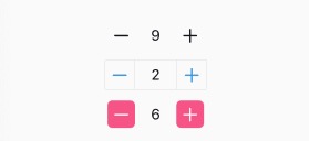
采用 minus-value-plus 三段式的设计。
- minus,左侧减少的图标;
- value,值;
- plus,右侧增加的图标;
- mix,最小值;
- max,最大值;
- step,步长;
<n-stepper v-model="value1"></n-stepper>
<n-stepper v-model="value2" minusType="primary" plusType="primary" :min="0" radius="none" :minusBoxStyle="minusBoxStyle" :plusBoxStyle="plusBoxStyle" :valueStyle="valueStyle"></n-stepper>
<n-stepper v-model="value3" minusBgType="error" minusType="inverse" plusType="inverse" plusBgType="error" :step="2" :min="0" :max="10" radius="base"></n-stepper>
{
	minusBoxStyle: 'border-width:1px;border-top-left-radius: 6rpx;border-bottom-left-radius:6rpx;border-color:#EBEBEB;width:68rpx;height:68rpx;',
	plusBoxStyle: 'border-width:1px;border-top-right-radius: 6rpx;border-bottom-right-radius:6rpx;border-color:#EBEBEB;width:68rpx;height:68rpx;',
	valueStyle: 'border-top-width:1px;border-top-color:#EBEBEB;border-bottom-width:1px;border-bottom-color:#EBEBEB;height:68rpx;'
}
Props #
| Prop name | Description | Type | Values | Default |
|---|---|---|---|---|
| min | 最小值 | number | - | 1 |
| max | 最大值 | number | - | 100 |
| step | 步进长度/步长 | number | - | 1 |
| value | 值 | number | - | 1 |
| disabled | 是否禁用 | boolean | - | false |
| readOnly | 输入框是否只读 | boolean | - | true |
| minus | 左侧减少的图标 | string | - | 'minus-bold' |
| plus | 右侧增加的图标 | string | - | 'add-bold' |
| radius | 加减按钮的圆角主题 | string | - | 's' |
| minusBgType | 左侧减按钮的背景主题 | string | - | '' |
| plusBgType | 右侧加按钮的背景主题 | string | - | '' |
| hover | 加减按钮的 hover 主题 | string | - | 'opacity' |
| valueType | 中间值的颜色主题 | string | - | 'text' |
| valueSize | 中间值的尺寸主题 | string | - | 'l' |
| valueStyle | 值的样式 | string | - | '' |
| valueDisabledStyle | 禁用时值的样式 | string | - | '' |
| minusType | 减少图标的颜色主题 | string | - | 'text' |
| minusStyle | 减少图标的样式 | string | - | '' |
| minusDisabledStyle | 禁用时减少图标的样式 | string | - | '' |
| minusBoxStyle | 减少图标的外层样式 | string | - | '' |
| minusBoxDisabledStyle | 禁用时减少图标的外层样式 | string | - | '' |
| plusType | 增加图标的颜色主题 | string | - | 'text' |
| plusStyle | 增加图标的样式 | string | - | '' |
| plusDisabledStyle | 禁用时增加图标的样式 | string | - | '' |
| plusBoxStyle | 增加图标的外层样式 | string | - | '' |
| plusBoxDisabledStyle | 禁用时增加图标的外层样式 | string | - | '' |
| boxStyle | 外层样式 | string | - | '' |
Events #
| Event name | Properties | Description |
|---|---|---|
| less | ||
| input | ||
| change | ||
| over |