search #
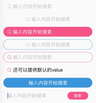
搜索组件。允许placeholder里面带icon图标。
- v-model支持;
如果您的search组件,不需要placeholder带图标之类的,而且稍微有些特殊,不太好适配,建议不要使用这个组件。
大多数情况下,可以使用n-input组件替换。
<n-search bgType="error" valueType="inverse" iconType="inverse" placeType="inverse" placeIconType="inverse"></n-search>
<n-search :fixIcon="true" iconType="error" placeIconType="error" border="all-error"></n-search>
Props #
| Prop name | Description | Type | Values | Default |
|---|---|---|---|---|
| value | 值 | string|number | - | '' |
| icon | 图标 | string | - | 'search' |
| placeholder | placeholder | string | - | "输入内容开始搜索" |
| position | 内容位置:left/center | string | - | 'left' |
| focus | 是否 focus | boolean | - | false |
| adjust | 键盘弹出方式:adjust-position | boolean | - | true |
| disabled | 是否禁用 | boolean | - | false |
| confirmType | confirm-type | string | - | 'search' |
| fixIcon | 是否固定图标。position 为 left 时可以将 icon 固定在左侧 | boolean | - | false |
| iconTextSpace | 图标与文字的间距 | string | - | '12rpx' |
| bgType | 背景色主题 | string | - | '' |
| valueType | 内容颜色主题 | string | - | 'text' |
| placeIconType | placeholder 显示时图标的颜色主题 | string | - | 'place' |
| iconType | 图标的颜色主题 | string | - | 'text' |
| placeType | placeholder 的颜色主题 | string | - | 'place' |
| height | 高度主题 | string | - | 'base' |
| border | 边框主题 | string | - | 'all' |
| radius | 圆角主题 | string | - | 'll' |
| space | 左右 padding | string | - | '32rpx' |
| valueSize | 内容的尺寸主题 | string | - | '' |
| iconSize | 图标的尺寸主题 | string | - | 'l' |
| placeSize | placeholder 的尺寸主题 | string | - | '' |
| boxStyle | 外层样式 | string | - | 'padding-left:32rpx;padding-right:32rpx;' |
| iconStyle | 图标样式 | string | - | '' |
| placeStyle | placeholder 的样式 | string | - | '' |
| valueBoxStyle | 内容的外层样式 | string | - | '' |
| valueStyle | 内容的样式 | string | - | '' |
| placeBoxStyle | placeholder 的外层样式 | string | - | '' |
Events #
| Event name | Properties | Description |
|---|---|---|
| input | ||
| confirm | ||
| focus | ||
| blur | ||
| keyboardHeightChange | ||
| searchClicked |
Slots #
| Name | Description | Bindings |
|---|---|---|
| extra |