check #
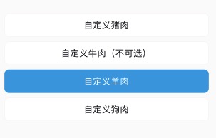
check 单多选
完全自定义内容的单多选。
<n-check v-model="models3" bgType="none">
	<n-check-item v-for="(item,idx) in items3" :key="idx" :value="item.value" :disabled="item.disabled" :border="models3.includes(item.value)?'all-primary':'all'" :bgType="models3.includes(item.value)?'primary':'inverse'" boxStyle="flex-direction:row;justify-content:center;align-items:center;height:80rpx;margin-bottom:16rpx;border-radius:16rpx;">
		<text :class="[models3.includes(item.value)?'n-color-inverse':'n-color-text', 'n-size-base']">{{item.title}}</text>
	</n-check-item>
</n-check>
{
	items3: [{title: '自定义猪肉', value: 0}, {title: '自定义牛肉(不可选)', value: 1, disabled: true}, {title: '自定义羊肉', value: 2}, {title: '自定义狗肉', value: 3}]
}
Props #
| Prop name | Description | Type | Values | Default |
|---|---|---|---|---|
| value | 初始值/绑定值 | array | - | [] |
| limits | 限制最多可选数量. 0 表示不限制 | number | - | 0 |
| disabled | 是否全局禁用 | boolean | - | false |
| bgType | 背景主题 | string | - | '' |
| border | 边框主题 | string | - | '' |
| radius | 圆角主题 | string | - | '' |
| boxStyle | 外层样式 | string | - | '' |
Events #
| Event name | Properties | Description |
|---|---|---|
| overed | ||
| input | ||
| change |
Slots #
| Name | Description | Bindings |
|---|---|---|
| default |
check-item #
check-item
必须作为check的子组件使用。
Props #
| Prop name | Description | Type | Values | Default |
|---|---|---|---|---|
| value | 唯一值/返回的内容 | number|string | - | '' |
| disabled | 是否禁用 | boolean | - | false |
| border | 边框主题 | string | - | '' |
| radius | 圆角主题 | string | - | '' |
| bgType | 背景主题 | string | - | '' |
| hover | hover 效果 | string | - | 'opacity' |
| boxStyle | 外层样式 | string | - | '' |
Slots #
| Name | Description | Bindings |
|---|---|---|
| default |