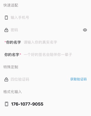
input #
采用 icon-label-value-indicator 四段式的设计。还开放了 label/default/extra 等插槽。
- 支持格式化;
- 支持MP端被遮罩层遮挡;
主要属性:
- icon,左侧图标;
- label,左侧label;
- value,输入内容;
- indicator,右侧图标;
input输入框适应了各种情况,你可以用它直接作为search组件来用。因为他比search组件更加灵活,可以适配的情况会更多。
<n-input v-model="phone" type="number" :maxlength="11" icon="phone" height="l" placeholder="输入手机号" space="20rpx" boxStyle="padding-left:10rpx;padding-right:10rpx;"></n-input>
<n-input v-model="password" :maxlength="24" :isPassword="true" :password="pwdNoVisible" :indicator="rightEye" icon="lock" height="l" placeholder="密码" space="20rpx" boxStyle="padding-left:10rpx;padding-right:10rpx;" @indicatorClicked="togglePwdVisible"></n-input>
<n-input height="l" placeholder="请输入你的真实名字" boxStyle="padding-left:10rpx;padding-right:10rpx;">
	<view class="n-flex-row n-wrap-nowrap n-align-center" slot="label" style="margin-right: 20rpx;">
		<text class="n-size-base n-color-error">*</text>
		<text class="n-size-base n-color-text">你的名字</text>
	</view>
</n-input>
<n-input v-model="code" type="number" :maxlength="4" icon="lock" height="l" placeholder="四位验证码" space="20rpx" boxStyle="padding-left:10rpx;padding-right:10rpx;">
	<view slot="extra" @tap="toGetCode">
		<text :class="['bi-code', seconds===0&&'bi-code-active']">{{codeHintText}}</text>
	</view>
</n-input>
<n-input v-model="phone2" :maxlength="13" icon="phone" iconSize="ll" height="l" :format="[3,4,4]" placeholder="输入手机号" separator="-" space="20rpx" boxStyle="padding-left:10rpx;padding-right:10rpx;" valueStyle="font-size:36rpx;font-weight:700;"></n-input>
Props #
| Prop name | Description | Type | Values | Default |
|---|---|---|---|---|
| format | 自定义格式,每一段的长度:[3, 4, 4] | array | - | [] |
| separator | 自定义格式的分割器 | string | - | " " |
| inputVisible | 是否隐藏掉 input 输入框 | boolean | - | true |
| type | input 的 type | string | - | "text" |
| maxlength | 最大输入 | number | - | 140 |
| isPassword | 是否用于密码输入框。 主要是为了兼容 iOS 下 type 与 password 共存时 type 不起作用 | boolean | - | false |
| password | 是否密码 | boolean | - | false |
| focus | 是否聚焦 | boolean | - | false |
| disabled | 是否禁用 | boolean | - | false |
| icon | 左侧图标 | string | - | '' |
| label | 左侧 label 文字 | string | - | "" |
| value | 值 | string | - | "" |
| placeholder | placeholder | string | - | "请输入内容" |
| indicator | 右侧图标 | string | - | '' |
| valueAlign | 文字排版 | string | - | 'left' |
| bgType | 背景主题 | string | - | '' |
| height | 高度主题 | string | - | '' |
| border | 边框主题 | string | - | '' |
| radius | 圆角主题 | string | - | '' |
| valueType | 值颜色主题 | string | - | 'text' |
| valueSize | 值尺寸主题 | string | - | 'base' |
| iconType | 图标颜色主题 | string | - | 'text' |
| iconSize | 图标尺寸主题 | string | - | 'l' |
| labelType | label 颜色主题 | string | - | 'text' |
| labelSize | label 尺寸主题 | string | - | 'base' |
| indicatorType | 右侧图标颜色主题 | string | - | 'text' |
| indicatorSize | 右侧图标尺寸主题 | string | - | 'l' |
| placeType | placeholder 颜色主题 | string | - | 'place' |
| placeSize | placeholder 尺寸主题 | string | - | 'base' |
| adjust | 键盘 adjust-position 弹出方式 | boolean | - | true |
| confirmType | confirm-type | string | - | 'done' |
| iconStyle | 图标样式 | string | - | '' |
| iconBoxStyle | 图标外层样式 | string | - | '' |
| labelStyle | label 样式 | string | - | "" |
| valueStyle | 值样式 | string | - | 'flex:1;' |
| indicatorStyle | 右侧图标样式 | string | - | '' |
| indicatorBoxStyle | 右侧图标外层样式 | string | - | '' |
| boxStyle | 外层样式 | string | - | "" |
| space | 内部各元素之间的空隙 | string | - | '12rpx' |
| placeStyle | placeholder 的样式 | string | - | '' |
Events #
| Event name | Properties | Description |
|---|---|---|
| focus | ||
| blur | ||
| keyboardHeightChange | ||
| input | ||
| formated | ||
| confirm | ||
| indicatorClicked | ||
| inputClicked |
Slots #
| Name | Description | Bindings |
|---|---|---|
| label | ||
| extra |