picker-time #
picker-time 时间选择器
picker-time其实就是picker-time-content在popup中的封装。
主要内容有:头部和picker-time-content区。
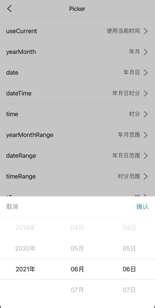
主要设置属性有:
- mode,date/dateTime/yearMonth/time/dateRange/yearMonthRange/timeRange;
- value,初始值,[2021, 6, 6]。需要注意的是,这个不是索引,而是值;
- useCurrent,是否默认选中当前值;
<n-picker-time :show="currentVisible" :useCurrent="true" mode="date" @cancel="toHideCurrent" @confirm="toConfirmCurrent"></n-picker-time>
Props #
| Prop name | Description | Type | Values | Default |
|---|---|---|---|---|
| show | 是否打开/显示 | boolean | - | false |
| mode | ['date'/年月日, 'dateTime'/年月日时分, 'yearMonth'/年月, 'time'/时分, 'dateRange'/年月日, 'yearMonthRange'/年月, 'timeRange'/时分] | string | - | 'date' |
| cancelText | 左侧取消文字 | string | - | '取消' |
| confirmText | 右侧确认文字 | string | - | '确认' |
| title | 中间标题 | string | - | '' |
| cancelType | 取消文字颜色主题 | string | - | 'third' |
| cancelSize | 取消文字尺寸主题 | string | - | 'base' |
| cancelStyle | 取消文字样式 | string | - | '' |
| confirmType | 确认文字颜色主题 | string | - | 'primary' |
| confirmSize | 确认文字尺寸主题 | string | - | 'base' |
| confirmStyle | 确认文字样式 | string | - | '' |
| titleType | 标题颜色主题 | string | - | 'text' |
| titleSize | 标题尺寸主题 | string | - | 'base' |
| titleStyle | 标题样式 | string | - | '' |
| headerBorder | 头部边框主题 | string | - | 'bottom' |
| headerRadius | 头部圆角主题 | string | - | 'top-base' |
| headerBgType | 头部背景主题 | string | - | 'inverse' |
| headerStyle | 头部外层样式 | string | - | '' |
| value | 值,不是索引 | array | - | [0,0,0,0,0,0,0] |
| useCurrent | 是否使用当前时间 | boolean | - | false |
| start | 年份的开始 | string | - | "1970" |
| end | 年份的结束 | string | - | new Date().getFullYear() + '' |
| includeBefore | 是否允许以前的年份。仅仅只是用在带年份选择的 mode 上 | boolean | - | true |
| includeAfter | 是否允许以后的年份 | boolean | - | true |
| range | 范围选择时中间的分割器 | string | - | '-' |
| bgType | content 的背景主题 | string | - | 'inverse' |
| textType | 选择项文字颜色主题 | string | - | 'text' |
| textSize | 选择项文字尺寸主题 | string | - | 'base' |
| height | content 的自定义高度 | string | - | '500rpx' |
| itemHeight | 选择项的自定义高度 | string | - | '100rpx' |
| boxStyle | content 的外层样式 | string | - | '' |
| itemStyle | 选择项的外层样式 | string | - | '' |
| textStyle | 选择项的文字样式 | string | - | '' |
| indicatorStyle | content 的 indicator-style | string | - | '' |
| rangeType | 范围分割器的颜色主题 | string | - | 'text' |
| rangeSize | 范围分割器的尺寸主题 | string | - | 'base' |
| rangeStyle | 范围分割器的样式 | string | - | '' |
| rangeBoxStyle | 范围分割器的外层样式 | string | - | '' |
Events #
| Event name | Properties | Description |
|---|---|---|
| confirm | ||
| cancel |
Slots #
| Name | Description | Bindings |
|---|---|---|
| header |
n-picker-time-content #
Props #
| Prop name | Description | Type | Values | Default |
|---|---|---|---|---|
| mode | ['date'/年月日, 'dateTime'/年月日时分, 'yearMonth'/年月, 'time'/时分, 'dateRange'/年月日, 'yearMonthRange'/年月, 'timeRange'/时分] | string | - | "date" |
| value | 值,不是索引 | array | - | [0,0,0,0,0,0,0] |
| useCurrent | 是否使用当前时间 | boolean | - | false |
| start | 年份 year 的开始 | string | - | "1970" |
| end | 年份 year 的结束 | string | - | new Date().getFullYear() + '' |
| includeBefore | 是否允许以前的时间,仅仅只是用在带年份选择的 mode 上 | boolean | - | true |
| includeAfter | 是否允许未来的时间 | boolean | - | true |
| range | 范围选择分隔符 | string | - | '-' |
| bgType | 背景色主题 | string | - | 'inverse' |
| textType | 选择项的文字颜色主题 | string | - | 'text' |
| textSize | 选择项的文字尺寸主题 | string | - | 'base' |
| height | 自定义高度 | string | - | '500rpx' |
| itemHeight | 选择项的自定义高度 | string | - | '100rpx' |
| boxStyle | 外层样式 | string | - | '' |
| itemStyle | 选择项的外层样式 | string | - | '' |
| textStyle | 选择项的文字样式 | string | - | '' |
| indicatorStyle | indicator-style | string | - | '' |
| rangeType | 范围分隔符的颜色主题 | string | - | 'text' |
| rangeSize | 范围分隔符的尺寸主题 | string | - | 'base' |
| rangeBoxStyle | 范围分隔符的外层样式 | string | - | '' |
| rangeStyle | 范围分隔符的样式 | string | - | '' |
Events #
| Event name | Properties | Description |
|---|---|---|
| inited | ||
| change |